Listen to this articleLoading audio…
There is a relentless pressure to ship code faster than ever before, the pressure to deploy quickly often overshadows the necessity of building well. We are constantly pushed to prioritize speed, agile sprints, and rapid product launches to stay competitive. However, simply pushing code to production is not enough. The real challenge lies in delivering software that actively drives value and that users genuinely want to engage with.
Currently, the industry is caught in a dangerous cycle. The “ship it yesterday” mentality has conditioned teams to treat the User Interface (UI) and the overall digital experience as secondary concerns. Many operate under the assumption that speed and quality cannot coexist, believing that building fast inherently requires cutting corners on the interface.
This mindset is a strategic mistake. Viewing the user experience as an expendable luxury is a guaranteed way to build a product that fails in the real world. A polished UI is not a development bottleneck. Instead, it serves as a powerful engine for sustainable and high-velocity growth. It is the vital translation layer between complex backend architecture and human cognitive limits. If that interaction fails, the entire product fails, no matter how sophisticated the underlying technology might be.
We need to move beyond theoretical debates about development speed and start focusing on execution. It is entirely possible to build rapidly while maintaining a world-class digital experience. Here is how we can put that into practice.
The Hidden Tax of “UX Debt”
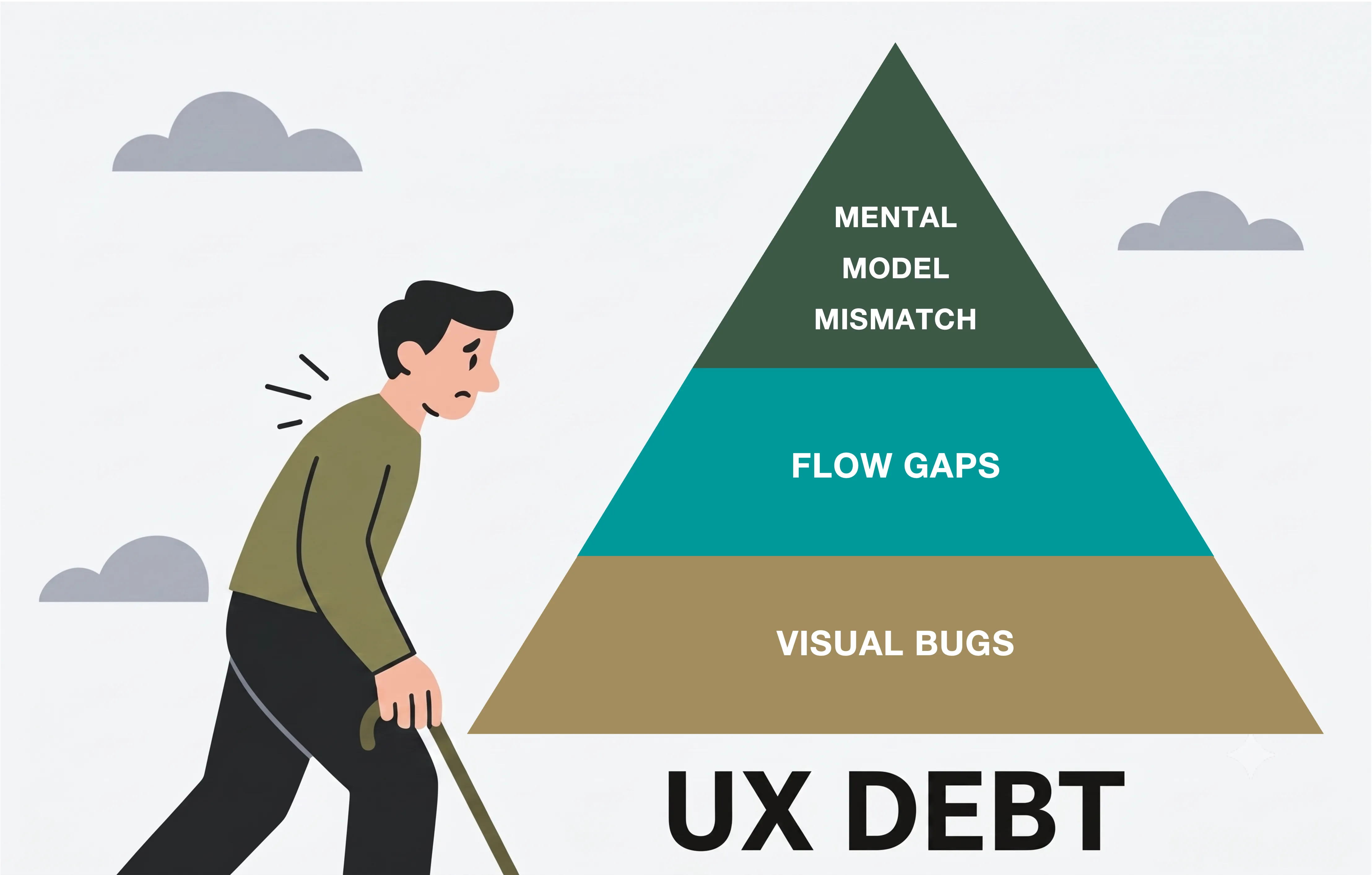
Business stakeholders intuitively understand technical debt, but they rarely track its silent partner: UX debt. The illusion of saving time by rushing a clunky UI to hit a launch date does not actually save money. It merely defers the cost from the development phase to the operational phase.
For consumer-facing applications, this tax is paid aggressively in user churn, abandoned workflows, and bloated customer support queues. For internal tools, the tax is just as heavy, paid in lost employee productivity, data entry errors, and the endless friction of training staff on counter-intuitive systems.
A major symptom of UX debt is the “information dump” problem. I firmly believe that extensively dumping raw data or overwhelming options onto a screen comes across as though you simply do not care enough to make sure the person on the other side is on the same page as you. It is the digital equivalent of poor communication. When an interface is cluttered and lacks a curated hierarchy, crucial information inevitably slips through the cracks. Good UI curates the conversation. It respects the user’s time and ensures that the system and the user are perfectly aligned at every step of the journey. Shipping fast with a bad UI is not a victory; it is just a cost-containment failure waiting to happen.
Standardization is the Engine of Speed
If you want to ship fast without sinking the ship, the secret weapon is standardization. The reason UI often slows down development is because teams waste time reinventing the wheel. Developers should not be burning hours deciding how a dropdown menu should behave, what padding a button requires, or how a modal should transition.
By leveraging robust design systems and pre-built component libraries, you eliminate decision fatigue. When the foundational visual and interactive elements are standardized, teams can launch highly polished applications in a fraction of the time.
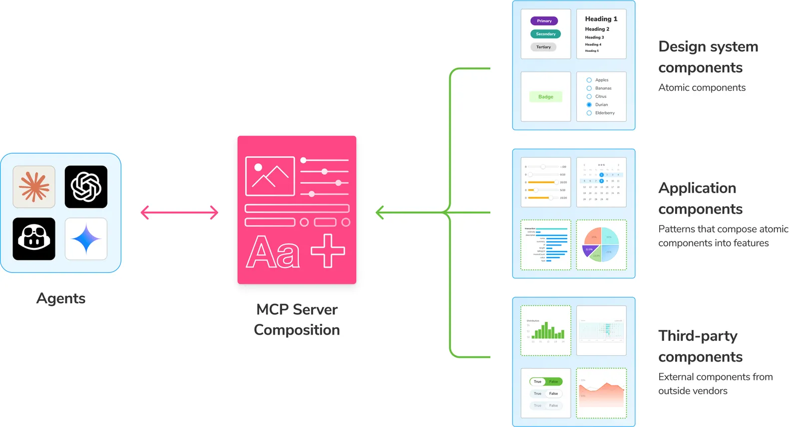
Historically, design systems were just static documentation for humans, but today, true standardization means making your architecture machine-readable. Take a tool like Storybook, for example. With the introduction of the Model Context Protocol (MCP), AI coding agents can now connect directly to your Storybook workspace. Instead of hallucinating UI elements or injecting rogue styles, the AI queries your existing React component library before writing a single line of code. You achieve rapid deployment while delivering an interface that feels intentional and seamless. Consistency breeds trust, and a standardized UI ensures that every new feature feels familiar, drastically reducing the learning curve and accelerating user adoption. You are not sacrificing speed; you are utilizing architecture to enable it.
Automating the Plumbing to Obsess Over Experience
The modern technology stack allows teams to move incredibly fast by offloading backend complexity. We no longer have to manually build every single piece of infrastructure from scratch. This is where the true power of automation enters the picture.
With advanced orchestration platforms like n8n, we can break the cycle of manual backend grinding. We can seamlessly connect top-tier AI models, like ChatGPT or Claude, directly to the tools our teams already use, bringing the power of automation to any workflow. Whether it is handling data routing, deploying autonomous agents, or managing complex API integrations, the heavy lifting can be orchestrated effortlessly.
The great advantage here is resource reallocation. Because we can automate the plumbing and orchestrate complex workflows behind the scenes, we free up massive amounts of engineering bandwidth. That saved time can, and strictly should, be reinvested directly into polishing the digital experience. By letting platforms like n8n handle the execution of the backend strategy, your team can focus on what really matters: designing an intuitive, frictionless interface that users actually want to engage with.
Scope Reduction Over Quality Reduction (The “Fewer, Better” Principle)
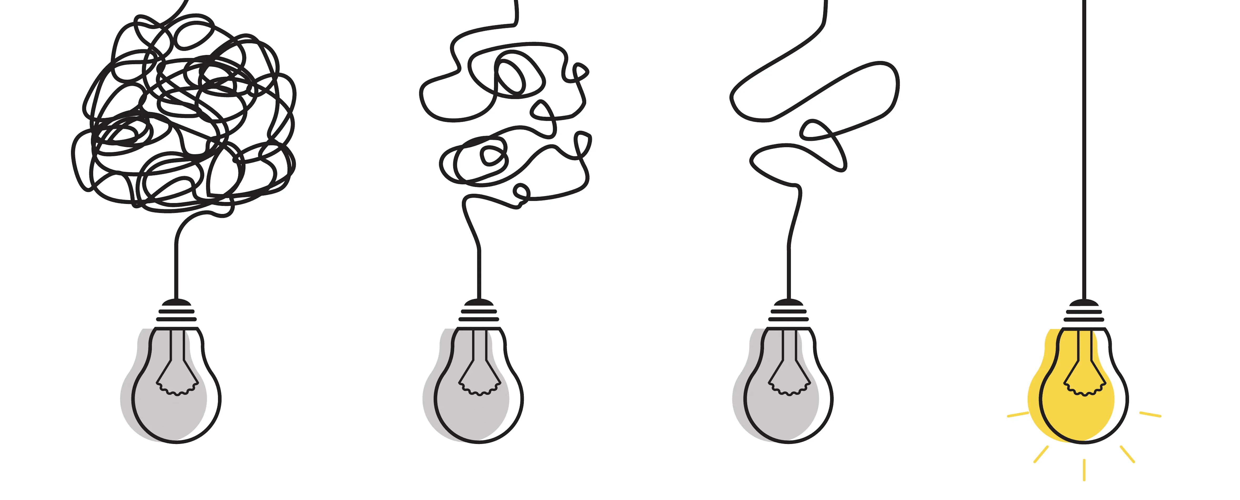
When forced to meet tight deadlines, the instinct is often to reduce the quality of the interface to ensure all requested features are delivered. This is the feature factory fallacy. The highest-performing digital experience strategies focus on shrinking the scope, not the quality.
Delivering ten mediocre features by Friday provides far less business value than delivering three flawless, frictionless workflows. A fast deployment should focus strictly on the core action the user needs to take. Strip away all navigational friction and focus on minimizing the “Time-to-Value.” A web app that executes one single workflow perfectly builds infinitely more trust than a bloated platform that does ten things poorly.
Furthermore, a reduced scope allows teams to design for the “unhappy paths.” This is known as graceful degradation. How does the system handle an unexpected failure? If there is a sudden SRE timeout, a dropped connection, or a misconfigured load balancer, does the UI just crash to a blank white screen? Good UI anticipates these moments. It degrades gracefully, preserves the user’s unsaved state, and explains the error in plain, human language. Designing for failure is where true digital maturity shows, and it is only possible when you prioritize quality over sheer volume.
Agility and the Accelerated Feedback Loop
Finally, treating UI as a priority is the ultimate enabler of business agility. When you ship a confusing, rushed interface, the user feedback you receive is incredibly noisy. If users are abandoning a workflow, you are left guessing: Is the core product offering fundamentally flawed, or could the user simply not find the right button to click?
A clean, intuitive UI isolates the variables. If the interface is frictionless and straightforward, and the user still is not engaging, you know immediately that you have a product-market fit issue, not a design issue. Good UI cuts through the noise. It accelerates the business’s ability to learn, adapt, and pivot with absolute confidence.
Moving From Theory to Practice
It is time to stop imagining the efficiency that a strong digital experience can bring and start demanding it. The narrative that you must choose between building fast and building well is obsolete. By standardizing design components, ruthlessly reducing initial scope to focus on quality, and utilizing powerful orchestration tools to automate backend plumbing, teams can deliver exceptional user interfaces at incredible speeds.
In an era where backend infrastructure is increasingly commoditized and automated, the interface is no longer just the wrapper; the interface is the product. It is the primary competitive differentiator. Challenge your teams to stop extensively dumping data onto screens and start curating experiences. Do not settle for the hidden tax of bad UI. Focus on what really matters, put these principles to work, and make things happen.